
The Natural & Organics Show (NOPEX) will be taking centre stage once more at…

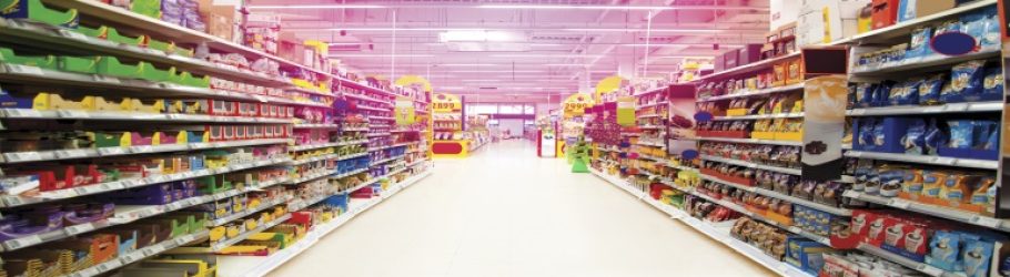
Food manufacturers and marketers will know how much of an impact colour can have on the sales of their products. We are often told of how particular colours can seem more attractive to consumers when they see it on the supermarket shelves. However, this is not true only of the packaging, but also of the food itself.
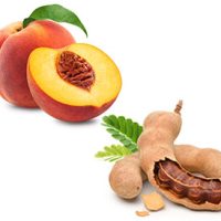
It is thought that the human brain is particularly attracted to red foods and favours red hues over green. This has been linked to children traditionally rejecting vegetables in favour of other foods. The human brain often deems red foods to hold more calories than their green counterparts, which may well be a survival instinct, as foods with more calories will give energy and sustenance for a longer period of time.
 Despite the fact that this survival technique is no longer necessary, this seems to remain true as colours such as red and yellow are deemed to be the most attractive in food packaging. This is why fast food brands such as McDonald’s and Burger King use these colours in their branding and throughout their marketing – colour truly does sell. More recently though their colour schemes are beginning to change.
However, these colours needn’t be synonymous with fast food as they are naturally occurring, and are present in a number of fruits and vegetables. Food manufacturers can use this to their advantage by using the colours that are most attractive to market their own foods.
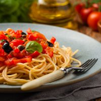
It is a balancing act when it comes to choosing colours for food packaging. For example, red is a stimulating colour for food, however, it can have negative connotations as it is so often associated with unhealthy foods. Not only is it a popular choice for fast food brands, it is used on the nutritional wheel on packaging to signal that it is not a healthy option.
Food manufacturers must work with the way the human brain reads packaging in order for their products to be selected from the shelves. One way in which they can do this is to use colour to signify flavour: for example – red for strawberry flavours, green for apple flavours. It is a straightforward method which simplifies the experience for the consumer and allows them to make fast decisions about the food they buy.
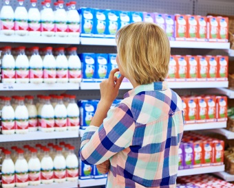
When choosing colours for food packaging most brands tend to stay away from blues and purples as they are considered unnatural and unappetising. Manufacturers also must match their colour choices to the message they wish to convey – bright colours are most commonly associated with sweet foods and drinks, whereas dark or muted colours give the impression of rich foods.
While colour has a huge impact on the sale of food products, there are many other elements which can influence consumers. This includes the presence of the KLBD Kosher label which signifies that the product is kosher certified by a recognised orthodox kosher certification agency. If you would like to find out more about how you can get certified, please don’t hesitate to contact us by calling +44 (0)20 8343 6255 to speak to a member of our team.
The Natural & Organics Show (NOPEX) will be taking centre stage once more at…
The continuing fixation with Italian cuisine remains a cornerstone of the global food industry….
Predictions for 2024 food and drink trends have already started to come to fruition…